SIMONLOCKYER
Good ideas deserve a good build. Explore the original projects, open the notebook and try something for yourself.
The original portfolio
LESS TALK.
MORE WORK.
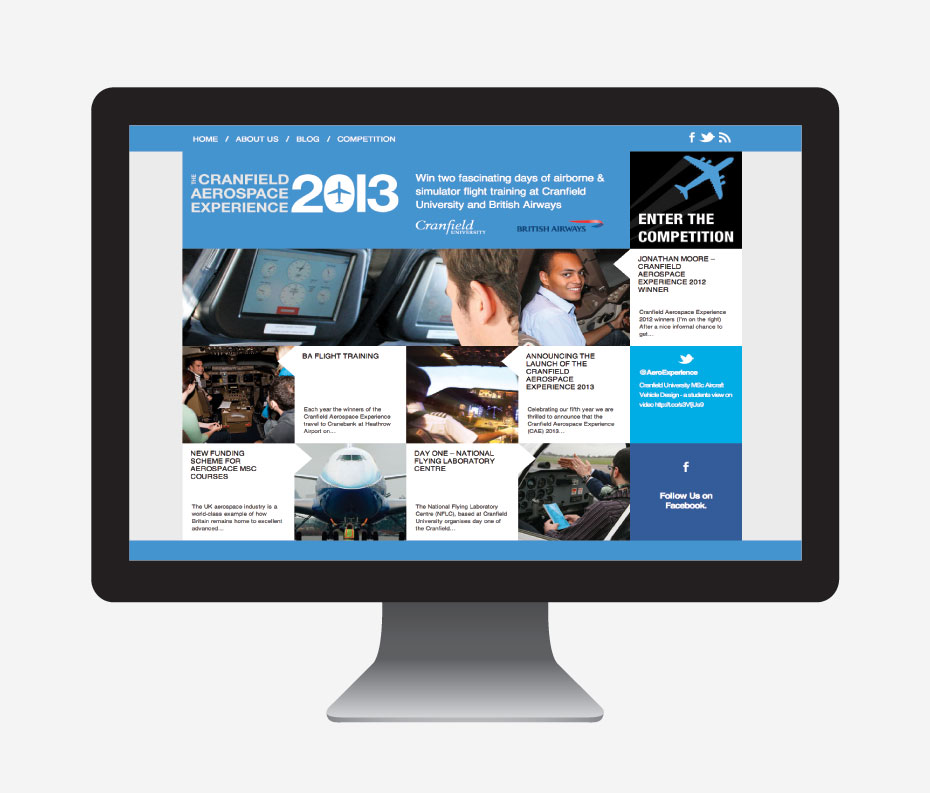
Aerospace Experience
Original project notes and preserved screens
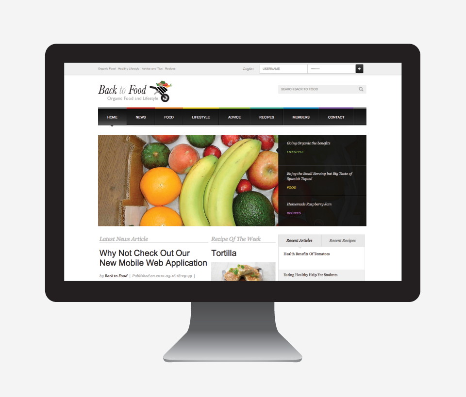
Back To Food
Original project notes and preserved screens
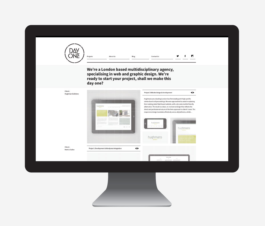
DayOneDigital
Original project notes and preserved screens
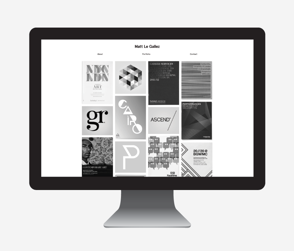
MATT LE GALLEZ
Original project notes and preserved screens
Original screens. Original project stories. A closer look at how the web was made.
A little room to experiment
ONE IDEA.
THREE VIEWS.
A layout should work with its content. Change the width and watch the same little page find a new shape.
Get to know relative sizing ↗BIG IDEA.
Make room
for the idea.
Same content. A different arrangement.
A useful little detour
MAKE
THE NUMBERS
MAKE SENSE.
Turn a font size into a relative unit. Try a value, change the base and see the relationship.
Or build a two-sided card ↗From the open notebook
THINK IT
THROUGH.
CSS em Units Explained
Understand relative sizing, work through nested text and convert pixels with a live calculator.
CSS Sticky Footer – Making your website footer stay at the bottom of the page tutorial
Build a footer that follows short and long content, with a working CSS Grid example.
How to flip a div with css3 and jQuery – Tutorial
Make an accessible flip interaction with a native button, keyboard support and reduced motion.
Affordable Web Design In Surrey – Special Offer
A dated service offer retained with its original context and a useful scope worksheet.
Best Free Fonts – All Time Top 10
Revisit the original ten-font selection and use a practical typeface checklist.