Original by Simon Lockyer · . The worked examples and guidance above the original text are a new editorial edition from 20 October 2026.
The second collection: compare the roles
This July 2013 follow-up explores different relationships between a display face and body text. Compare the contrast in weight, width and texture in the original samples below. Their appearance records those original files; it does not guarantee that a present font release is identical.
Before deciding, try your longest heading and a paragraph at the smallest size you expect to publish. Check punctuation and language coverage, then record the actual licence and file weights. Open the live pairing sketch and worksheet →
From the original collection
Read the original 2013 article
A few months ago I wrote a blog post showing 10 good combinations of google web fonts. The feedback and views of the blog post were outstanding so I have decided to write a part 2 showing some other great google web font combinations. I hope you enjoy it and do let me know if you have any suggestions!
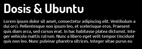
Dosis & Ubuntu
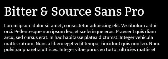
Bitter & Source Sans Pro
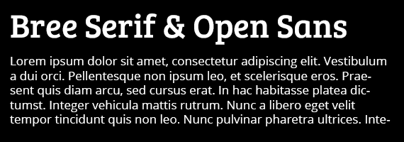
Bree Serif & Open Sans
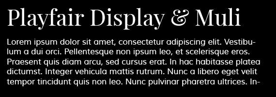
Playfair Display & Muli
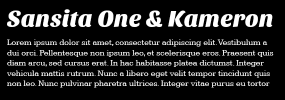
Sansita One & Kameron
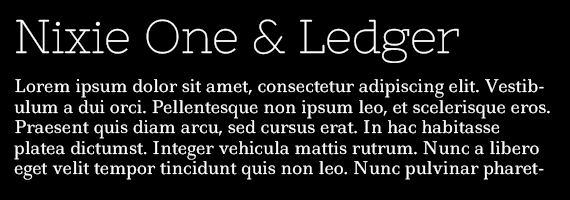
Nixie One & Ledger
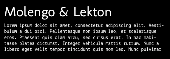
Molengo & Lekton
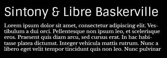
Sintony & Libre Baskerville
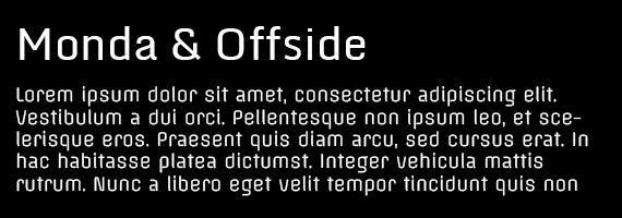
Monda & offside
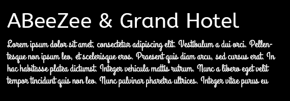
AbeeZee & Grand Hotel
Original archived capture. Historical prices, donation requests, browser workarounds and external links are retained as context, not current offers.