Original by Simon Lockyer · . The worked examples and guidance above the original text are a new version from 20 October 2026.
Choose a pair by testing real content
The original collection below records the typography of 2013. For a current project, start with roles rather than a long font list: a readable body face, a distinctive heading face and a fallback that keeps the page usable before a download finishes.
A quick pairing sketch
Make room for a good idea.
Design is a sequence of decisions. A clear hierarchy helps the reader find the next useful one. Check 0123456789, £ € $, italics, and the longest name in your content.
This sketch uses system fonts. It demonstrates contrast between typographic roles, not the exact appearance of an archived Google font.
A practical selection sheet
- Use a real page title, a 100-word paragraph, navigation, numerals and a form label.
- Test the smallest body text on a phone. Compare the x-height and line length rather than the nominal font size alone.
- Check all required language characters and the licence for the actual files you will use.
- Limit weights to the ones the interface needs. Downloading unused weights wastes bandwidth.
- Test the fallback and the loaded font. Different glyph widths can move the page.
A useful starting point is a single family with contrasting sizes and weights. Add a second family only when it provides a clear role. Avoid choosing two similar faces that look accidentally mismatched.
Write down the decision
Heading: [family, weight, fallback]
Body: [family, weight, fallback]
Languages: [characters tested]
Licence: [source and permitted use]
Files: [formats and total size]
Checks: [phone, zoom, fallback, loading shift]
Reference: web.dev: font loading and layout stability. worksheet, 20 October 2026. Archived download links do not establish current font licensing.
From the original collection
Read the original 2013 article
Google Web Fonts started out with a handful of fonts on offer to the public, these days there are over 600 to choose from. This large resource comes in handy when designing websites allowing a designer to include a new custom font with the copy and paste of a small snippet of code.
Whilst the large resource is hugely beneficial, sifting through over 600 fonts to find combinations that work can be time consuming and quite hard work. I have written this article on which fonts I think work well together and that I have used in past and current projects.
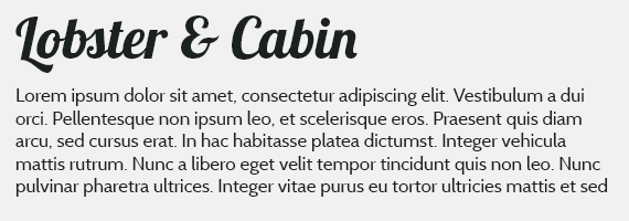
Lobster & Cabin
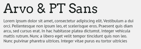
Arvo & PT Sans
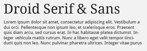
Droid Serif & Droid Sans
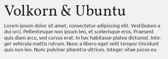
Volkorn & Ubuntu
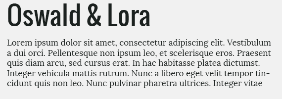
Oswald & Lora
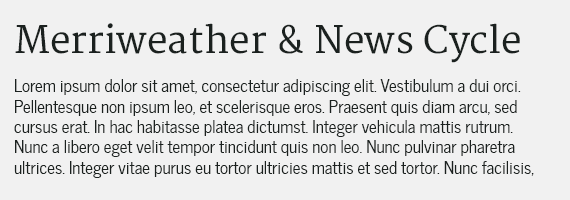
Merriweather & News Cycle
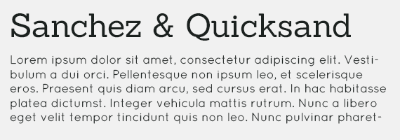
Sanchez & Quicksand
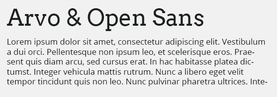
Avro & Open Sans
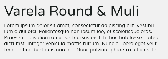
Varela Round & Muli
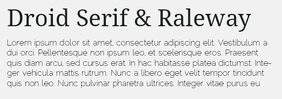
Droid Sans & Raleway
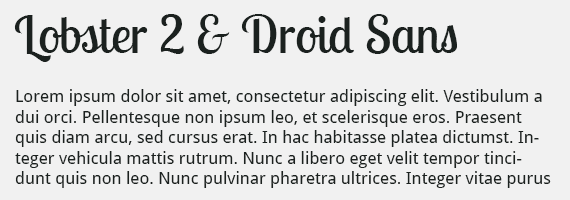
Lobster 2 & Droid Sans
I hope this is somewhat helpful. Thanks for reading!
Original archived capture. Historical prices, donation requests, browser workarounds and external links are retained as context, not current offers.